Data visualization
The visualization panel allows you to conduct online exploratory data analysis. We use histograms, bar plots, pie charts, and violin plots to present various types of data analysis results.
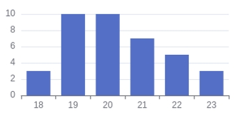
The histograms present the distribution of classes with a large range, like the question of Age (Q2).
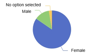
The pie plots present the distribution with small number of classes, like the question of Gender (Q3).
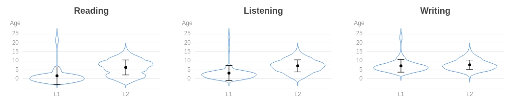
The violin plots present the distribution of data points for each group and the distribution differences among the groups, like the question of AoA (Q7).
All the plots are interactive. You can move your mouse cursor to highlight parts of the plots and the details of the highlighted parts will pop up in small windows. You can save the plots as image files via right-clicking the plots.
Violin plot
Violin plots visualize the data points and show the probability density of these values. The density is automatically smoothed using a kernel density estimator.
Each side of the blue line is a kernel density estimation, showing the distribution of the data: a wider section of the plot represents a higher probability that the participants of this group will take on the given value, while a thinner section represents a lower probability.
Inside of each violin plot, means and standard deviations are also marked.